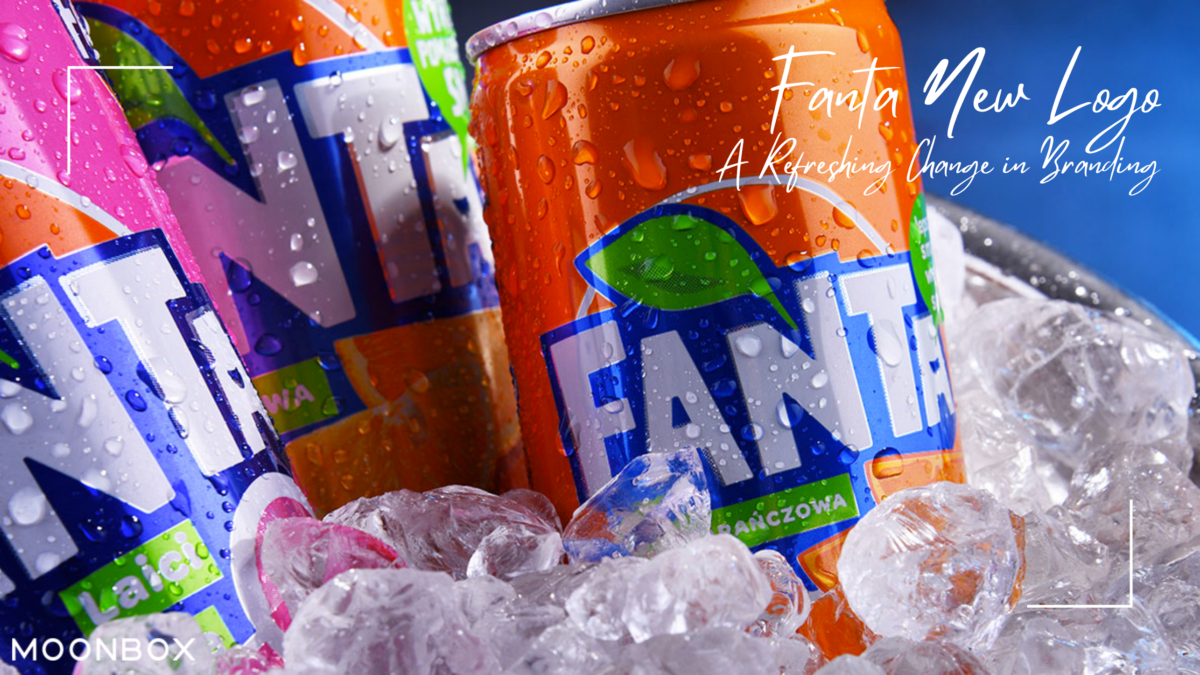
In the world of branding, a logo is not just an image; it’s a visual representation of a company’s identity and values. When a well-established brand decides to change its logo, it’s a significant decision that can either breathe new life into the brand or risk alienating its loyal customer base.
Fanta, the renowned beverage company, recently unveiled its new logo, sparking curiosity and discussion among consumers. In this article, we’ll explore the evolution of Fanta, the importance of a logo, the previous logo, and the reasons behind the rebranding decision- Fanta New Logo.
The Evolution of Fanta
Fanta, known for its wide array of fruit-flavored carbonated drinks, has a rich history dating back to its inception in the 1940s. Over the years, Fanta has adapted to changing consumer preferences and market trends. This evolution has been instrumental in maintaining its relevance in a highly competitive beverage industry.
The Importance of a Logo
A logo serves as the face of a brand. It’s the first thing consumers notice and associate with a product. A well-designed logo can communicate a brand’s values, personality, and message effectively. As a result, changing a logo is a strategic decision that must align with the brand’s evolving identity.
Old Fanta Logo
Before the recent rebranding, Fanta’s logo had been in use for a substantial period. The previous logo featured bold, playful lettering in orange and blue, encapsulating the brand’s vibrant and fun image. It had become synonymous with Fanta’s identity over time.
The Rebranding Decision
Rebranding is not undertaken lightly, and Fanta’s decision to change its logo was driven by a desire to keep up with modern design trends and changing consumer tastes. The brand recognized the need to adapt and refresh its image to stay relevant in a highly competitive market.
The New Fanta Logo Unveiled

The new Fanta logo, a result of careful planning and creative design, has been met with both excitement and curiosity. It retains the brand’s signature orange and blue colors but presents them in a fresh, contemporary design. The bold and playful lettering remains, emphasizing the brand’s fun-loving nature.
Design Elements and Symbolism
The new Fanta logo incorporates various design elements that symbolize Fanta’s commitment to innovation and the evolution of its product line. The dynamic, flowing lines in the logo represent movement and energy, highlighting the brand’s dynamic nature.
Color Palette Selection
Fanta’s choice of orange and blue in its logo has always been symbolic of its fruity and refreshing beverages. The use of these colors in the new logo maintains a sense of continuity with the brand’s heritage while adding a modern twist.
Impact on Brand Identity
The new Fanta logo aligns with Fanta’s mission to provide consumers with refreshing and innovative beverages. It communicates a sense of modernity and vitality that the brand aims to project.
Consumer Perception
Consumer perception plays a vital role in rebranding. Fanta’s aim with the new logo is to convey freshness and excitement. Early responses from consumers suggest that the logo change is resonating positively with them.
Marketing and Promotion
Changing a logo is not just about altering the brand’s image; it’s also about marketing and promoting the change effectively. Fanta is leaving no stone unturned in creating awareness and building anticipation around its new fanta logo.
Rollout Strategy
Fanta has devised a well-thought-out strategy for rolling out the new logo across its product line and promotional materials. This strategic approach ensures a seamless transition for consumers.
The Key Elements of Fanta’s Logo
#1. Vibrant Color Palette
Fanta’s logo has always featured a vibrant color palette. The use of bold and playful colors, such as orange, blue, and yellow, has become synonymous with the brand. This color scheme not only appeals to the target audience but also conveys the essence of the product – a fun and fruity drink.
#2. Iconic Bubbles
The bubbles in the logo symbolize the carbonation and effervescence of Fanta. They add a sense of excitement and refreshment, making the logo instantly recognizable and memorable.
#3. Playful Typography
Fanta’s choice of typography is playful and dynamic. The use of bold, curved letters reflects the brand’s youthful and energetic spirit. It also makes the logo easily readable and memorable.
#4. Consistency
One of the key reasons for Fanta’s global success is the consistency of its logo and brand identity. The logo has remained true to its core elements while adapting to modern design trends. This ensures that consumers can always identify Fanta, whether on a billboard, a can, or a digital platform.
Fanta New Logo – Fanta Unveils a Fresh Logo as Part of Its Inaugural Global Brand Identity Rollout
After successfully promoting the Sprite brand on a global scale last year, The Coca-Cola Company has shifted its focus to Fanta.
Fanta, for the first time in its history, is set to introduce a single global brand identity with a uniform logo across all of its markets. Up until now, Fanta had maintained distinct logos and packaging designs in the United States compared to its international counterparts. While the US market adhered to the rounded logo introduced in 2010, in 2017, the UK underwent a rebranding, adopting a logo featuring a more angular font and a green leaf motif, enclosed by a colored circle representing the flavor. Most of Fanta’s international markets followed suit, utilizing a logo akin to the UK version, albeit with slight variations in some regions.
The Coca-Cola Company, the parent organization of Fanta, believes that this unification of Fanta’s brand identity worldwide will elevate it to a consistent and prominent position alongside other iconic brands within The Coca-Cola Company’s portfolio, including Coca-Cola and Sprite. The new brand identity is already available both in physical stores and online channels, marking a significant shift in Fanta’s global branding strategy.
Developed in collaboration with Jones Knowles Ritchie, the new logo closely resembles the one introduced in the UK six years ago. It features a similarly angular font and retains the inverted blue and white coloring. However, the new logo departs from the previous version by eliminating the colored circle and green leaf.
Fanta, established in 1940, is the second oldest brand under The Coca-Cola Company’s umbrella. Over the years since its inception, its identity and logo have undergone significant transformations, as noted by Sue Murphy, the Senior Director of Design.
“With this refresh, our objective was to refine each element of the brand, making it bold and iconic to ensure its longevity and global recognition,” she explains.
Conclusion
In conclusion, Fanta’s new logo represents a bold and refreshing change in the brand’s image. It aligns with the brand’s commitment to innovation and vitality. As consumer perceptions continue to evolve, Fanta’s logo change reflects its dedication to staying current and relevant.
FAQs
1. Why did Fanta decide to change its logo?Fanta changed its logo to adapt to modern design trends and evolving consumer preferences while maintaining its brand’s identity.
2. What are the key design elements in the new Fanta logo?
The new Fanta logo features dynamic, flowing lines that represent movement and energy.
3. How have consumers reacted to the new Fanta logo?
Early responses from consumers have been positive, indicating that the logo change is resonating well with them.
4. How is Fanta promoting its new logo?
Fanta has a comprehensive marketing and promotion strategy to create awareness and anticipation around its new logo.


