Nov 24, 2023
ADNOC ( The Abu Dhabi National Oil Company) is the biggest oil company in the United Arab Emirates. It is a government-owned company. In more than 50 years, it has developed into a commercially successful brand.
A business should also keep in mind that this bird symbolizes force and courage. The falcon’s claws were depicted in the original logo, with many details. There was a red flame in its chest, indicating that ADNOC was an energy company.
Moonbox, a premier Dubai-based logo design company and branding agency, excels in capturing wonder through a proven formula of storytelling and effective communication, elevating businesses to new heights.
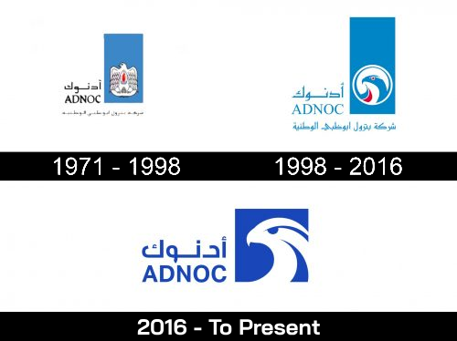
An ADNOC logo has always featured a stylized falcon. There has, however, been a dramatic change in the appearance of the bird. From a cluttered design to a sleek modern logo, it has come a long way.
First of all, why did the company choose the falcon as its symbol? In order to understand this, it is important to remember that falcons are the national bird of the UAE. The company’s roots are emphasized by this choice, which is in some ways a tribute to the country. The company has always had national ambitions, as well.
Additionally, this bird represents strength and courage, which are important qualities for a business.
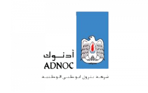
A falcon’s head claws were depicted in the original logo, along with plenty of details. In its chest, a red flame indicated that ADNOC was an energy company.
There was plenty of blank space above the bird’s head inside a rather large blue rectangle. The bird emblem became even more realistic when it symbolized the sky. The downside was that it didn’t work this way here and created the illusion that someone had forgotten to cut off the excess.
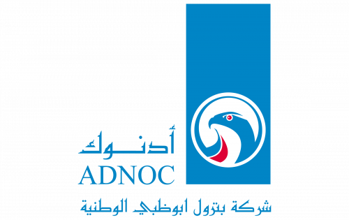
We can still see the blue “sky” in the second ADNOC logo, which looks like a piece of paper the designers forgot to remove.
However, the bird looks far more modern than it did in the previous version. Since only the head is left, the expression on the bird’s face is more prominent, so there are more emotions. Swooshes also create a dynamic style on the falcon. The flame is gone, but a red stroke remains on the bird’s chest.
Unlike the original logo, this one features the wordmark in blue. Since the emblem also lost black elements, the designer had to change the lettering’s color to match the simpler palette.
Bilingualism remains in the logo. The type in the English version of the wordmark is legible and retains its overall style. However, due to the disappearance of the unique strokes in the previous version, it’s lighter and more generic.
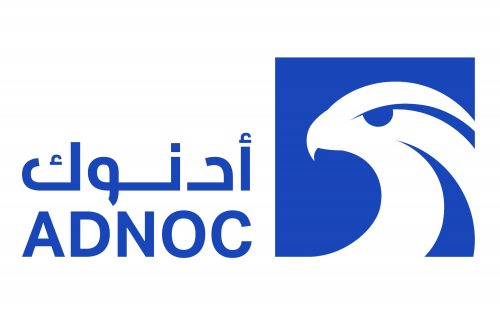
ADNOC announced the adoption of a new logotype in November 2016. It is also simpler than its predecessor. By far, it looks sleeker and more effective.
The bird’s head now occupies most of the surface. This white box has blue details and is enclosed in a blue box. The box is a square instead of a rectangle like the previous logo. Therefore, there is no blank space. Thus, the emblem appears more proportionate and logical.
There is no longer a red swoosh on the falcon’s chest. As a result, flame symbolism is no longer present. However, the swoosh itself did not clearly refer to the flame. To understand its meaning, you had to compare it with the previous logos, while the 2016 version can be understood without knowing this allusion.
Warning : All logos are protected under international copyright laws and copyrighted to their respective owners. Any content may not be reproduced, distributed, published, transmitted, modified, or otherwise exploited without prior written permission.
The ADNOC logo has always been blue. There is a darker shade in the 2016 version. Partly due to the darker color and partly due to the larger glyphs, the wordmark is more legible.
