Categories
Blogs

The Essentiality Of Brand Authenticity In the Digital World

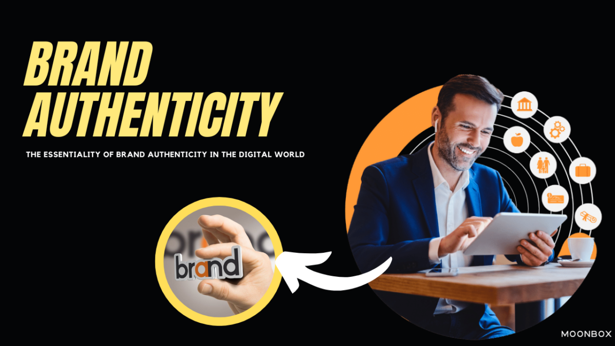
In the fast paced world of digital marketing, an authentic brand stands as torchbearer for escorting businesses towards true success. Promises are just mere words, if the brand does not strive to live up to them, continually, sincerely and transparently. In that pursuit, navigating through the chaos and hurdles of the digital world becomes nothing less than a necessity. In this blog, we will dig upon the nuances and ideas behind authentic branding and how the right actionable strategies can cultivate trust, loyalty and that deep sense of connection you aspire to build with your target market and audience. 

What is Brand Authenticity?

At its very inherent core, brand authenticity simply means the commitment a brand makes in congruence to its values, communication, message and actions, all cohesively. The definition of brand authenticity simply trumps over the superficial conceited marketing tactics, encapsulating the genuine and true essence of the brand. In that regard, authenticity is something that consumers resonate with on an intuitive and emotional level, fostering trust and brand loyalty, a great asset for any brand. 

How To Build Brand Authenticity? 

Craft Your Brand’s Story

Everyone loves listening to a compelling story, especially your audience would want to, about you. You must not merely just string words together, you must weave a captivating narrative that consolidates the complete essence of your brand. Start from jotting along the lines of the vision and mission of your brand. Then delve into what your brand is, where it is from and where it aspires to head in the future. Now highlight the unique selling points, something that makes you stand apart from the crowd. Furthermore, you can add what is the zeal that drives your brand? 

Once you are able to draw the canvas of your brand’s identity, tailor these elements authentically by sharing anecdotes, milestones and experiences that stupefy your audience and grab their attention towards the brand’ journey, values and the true purpose. You can employ several channels for this purpose such as your website, social media platforms, email newsletters so that your brand’s story is communicated on pan-digital plane. By doing this, you are able to portray the heart and soul of your brand, so that it forges a more profound connection with your audience, instilling a sense of belongingness. 

Harnessing the Power of Social Media for Brand Community Building

It is irrefutable that social media has revolutionized the way brands interact with their audience base, enabling them the unparalleled opportunity to build a community and engage with them. To harness this power, you must start by identifying the platforms that are the best for this purpose. Which means you will have to analyze in adept as to when your audience is most active, what are they inclined towards. Start by creating a specific Facebook Groups, where stir engagement through shared experiences, addressing frequently asked questions, and connecting with like-minded people. 

Recently influencer marketing has become a popular way of making young and talented minds become the face of the brand. Moreover you can also percolate into other existing communities through addressing comments, concerns and soliciting feedback. This will associate a sense of conduciveness and inclusivity with your brand as the audience will feel valued and heard. And considering that social media platforms are brimming with young, fresh and talented target markets, you can champion a major brand advocacy by doing this right. 

Harnessing the power of social media for brand community building becomes seamless with Moonbox’s innovative social media services, designed to engage, grow, and foster loyal communities around your brand.

Humanizing Your Brand

In the precarious digital world that we are living in, consumers crave authenticity, especially from the brands that they support. Not Ai, but humans crave for humans. That’s what makes a brand authentic. One extremely powerful way of doing that is by humanizing your brand, i.e show more human interactions, faces and stories behind it. By doing this you get the best of both worlds. How? 

By sharing and putting up more faces of your team members, you not only humanize your brand in the race of AI generated content but also motivate and muster a sense of appreciation for your team members. Sounds amazing right? Share more behind-the-scenes glimpses of your team in action, from brainstorming sessions, product analysis meetings, morning scrum meetings to even team outings and HR activities. This builds a solid foundation of credibility with your audience and also establishes transparency and authenticity of the brand. 

Consistent & Continual Communication

Consistency is vital when it comes to brand communication. Be it from messaging, emails, newsletters, press releases, or business communications, you must pay due attention to the right tone, voice and visual identity. You must be able to maintain consistency across all your channels so that the brand identity remains intact and uniform. 

You can start by creating a brand guideline, an outline of your brand’s root idea, core values, key messaging, chosen tone and visual elements and making your team hyperaware about it. Whether it is a simple social media post or your website content. This consistent, congruent and continual communication effort substantiates the brand’s reputation and your audience appreciates how seriously you take your brand’s messaging. 

Assessing the Authenticity

Once you are able to solidify your brand’s authenticity, you must be able to measure the impact to assess the effectiveness and refine your approach. Start by tracking the metrics of engagement levels, customer feedback and lead conversion from diverse platforms. This can give you valuable insight into what your audience thinks of your brand. Based on this assessment you can further amend and refine your approach of brand communication.

Bottomline

Brand authenticity is the cornerstone to survive this cruel, cut throat and chaotically competitive digital landscape. At this point, the importance of brand authenticity is well corroborated. This practice needs consistent commitment and alignment with core values on all vertices of your business. 

At Moonbox, we help you steer through this digital jungle and get the elixir of successful branding with authentic and creative strategies. Are you ready to have a heart to heart candid conversation with your audience? 

What’s stopping you? Let’s do this over the Moon together!

Categories
Blogs

Is Coach a Luxury Brand?

Is Coach a Luxury Brand?

Over the years, many people have asked this question, and the answer is not always clear.

Despite Coach’s reputation in the fashion world, it is not often viewed as a luxury brand on par with Chanel or Hermes.

What makes a luxury brand different from a non-luxury brand?

What is Coach Brand?

The brand has been a staple in many wardrobes since the 1940s. In today’s market, it is a forward-looking brand diversifying its offerings to change the luxury market.

Coach is what we’re talking about. Luxury leather goods brand is about to enter its next hype phase.Is Coach a luxury brand? What is a luxury brand? How do we define it?

Luxury Leather Goods at their Finest from Coach

Coach leather goods are the epitome of classic luxury. It is also known for its men’s and women’s clothing and accessories, but its bags and leather products have propelled it to success.

With its horse and carriage logo and the updated ‘C’ emblem, it’s an instantly recognizable brand. Coach appeals to the masses while maintaining its exclusive, luxury status, attracting celebrities, fashion-conscious consumers, and quality-conscious buyers alike.

The History

Since its founding in 1941, Coach has been inspired by the city where it was born – New York. Its minimalist yet statement designs remain popular today due to the brand’s ethos of authenticity and craft.

With fashion consumers becoming more trend-driven and focused on the next big thing, Coach’s popularity has peaked and troughed.

Monogram bags were popular during the 2000s and during the 60s, when the hippy chic vibe was popular.

Over the course of the 2010s, Coach took a back seat to other luxury fashion brands. Due to its creative director and refocused vision, it has seen a resurgence in recent years, largely appealing to younger consumers.

Also Read More on Is Michael Kors A Luxury Brand?

The Product

Coach’s high-end bags and accessories have contributed to the company’s success. The majority of its sales come from bags, which range from boxy, miniature silhouettes to slouchy silhouettes.

Unlike their high-street counterparts, luxury bags are crafted with the utmost care and quality.

The company has expanded into women’s, men’s and shoes, most recently with a preppy finish that appeals to many consumers searching for elevated basics.

As with many luxury brands, Coach has benefited from collaborations in order to expand its customer base. A playful collaboration with Observed By Us is catching the attention of Gen-Zers, such as Jennifer Lopez and Disney.

The Price Point

Is Coach a luxury brand? There is a lot to consider when it comes to price. Coach offers the style, heritage, and quality of a luxury brand, but at a much lower price point than some of the big fashion houses.

According to the style, the bags cost between £175 and £500. In comparison, Gucci charges between £800 and £2,000+ for its luxury bags. Consequently, many people have questioned whether Coach is a luxury brand.

As a luxury-level product that’s more affordable for the average consumer, Coach is often seen as the epitome of accessible luxury.

How does Coach fit into this picture? – Is Coach a Luxury Brand?

Although Coach is a high-quality brand with a strong reputation, it may not meet all of the criteria for a true luxury brand. Despite the fact that their products are well-made and often quite expensive, they are not necessarily exclusive or rare as some other luxury brands are.

Luxurious brands, however, are constantly evolving and can be defined differently by different people. Others may not consider Coach to be a luxury brand. Consumers ultimately determine whether a brand is a luxury brand.

Coach is clearly a well-respected and well-known brand in the fashion world, and its products are highly sought after by many consumers. It is undeniable that Coach bags are a stylish and high-quality choice for anyone shopping for a new handbag, regardless of whether you consider them to be a luxury brand. We would conclude that Coach is, in fact, a luxury brand when you combine innovation, quality, history, and popularity.

Known for its unwavering commitment to excellence and innovation, MoonBox is a leading Branding Agency in Dubai. In addition to offering outstanding branding solutions, this agency demonstrates a deep understanding of consumer preferences and market trends. MoonBox has become a preferred choice for businesses seeking to enhance their brand identity and thrive in the highly competitive business world due to their artistic flair and focus on customer satisfaction.

FAQ ( Frequently Asked Questions)

Is Coach a luxury brand?

Coach is not considered as exclusive as Louis Vuitton or Hermes despite its reputation as a luxury brand.

What are Coach’s advantages over other luxury brands?

Compared to other luxury brands, Coach is considered more affordable and accessible. Despite this, Coach’s products and quality are still considered high-end.

Coach products are expensive, but are they worth it?

Due to Coach’s reputation for quality and durability, many consumers believe its products are worth the price.

What is the manufacturing location of Coach products?

Several locations manufacture Coach products, including the United States, China, and Vietnam.

Is there an outlet store for Coach?

Coach has outlet stores where consumers can purchase discounted products.

What is the process for authenticating a Coach product?

The serial number and logo of an authentic Coach product are stamped on the item. In addition, consumers can check the brand’s website or contact customer service to verify the authenticity of Coach products.

Categories
Blogs

Is Kate Spade A Luxury Brand? All You Need To Know About

Among women, Kate Spade is a popular brand.

When it comes to high-end and luxury fashion, you may ask yourself, “Is Kate Spade a luxury brand?”

Like it or not, what you wear says a lot about who you are. You will need to know the answer if you want to portray a certain image.

Let’s begin by defining luxury. Based on these criteria, we’ll answer the question: Is Kate Spade a Luxury Brand?

As a brand that prides itself in offering some of the most stylish and boldest designs of bags and several other accessories, Kate Spade is one of the biggest fashion brands that isn’t just enviable but also considered a good trendy brand if you’re into designer brands or fashion.

Is Kate Spade a Luxury Brand? – Things to keep in mind

Kate Spade Brand

The Kate Spade brand was established in 1993 and offers a wide selection of items, including handbags and accessories. This brand is known for its six essential handbags, which all stand out well because of the brand’s optimistic femininity. Kate Spade is today a global fashion house and lifestyle brand known for its handbags, clothing, home décor, jewelry, shoes, and even tech accessories.

Additionally, Kate Spade offers highly detailed items that are nicely polished, giving off a chic appearance. If you want modern and highly sophisticated colors and designs that fit your personal style, Kate Spade is the brand for you. Founded on unique styles, joy, and the highest quality stitching and overall sturdiness, the brand is also known for its founding principles.

However, Kate Spade didn’t become a huge success overnight. Formerly Katherine Noel Brosnahan, Kate Spade began her career as an accessories editor at Mademoiselle. By 1991, however, she was frustrated and left the company because she could not create or find the perfect fashionable yet utilitarian handbag she had been craving for years. In order to create the perfect handbag, she set out from her apartment and created a collection of stylish handbags. Construction paper was used for her first sample designs, which she adapted from local flea markets and even secondhand stores. Additionally, she conducted extensive research on not just designs and styles, but also fabrics, production costs, and processes.

Kate Spade combined sleek handbag shapes with the brightest colors in a new and fashionable way, leading to 6 versions of Kate Spade bags that debuted her brand. By January 1993, she had launched a leading American luxury fashion house with the help of her husband, Andy, who helped her climb the social ladder. Kate Spade’s road to success began when all women who saw the bags loved them. They were instant hits, and the Kate Spade brand was born. Specifically, the bag design revolutionized the accessories industry. Upper-middle-class consumers were the main target audience.

Today, Kate Spade remains a brand of thoughtfully integrated designs that stand out as a hallmark of design, making it highly desirable and in high demand. A male fashion line was also created by them, Jack Spade. Kate Spade is one of Michael Kors’ biggest competitors due to its success.

Read More on : Is Michael Kors a Luxury Brand?

Is Kate Spade’s Product Exclusive or Rare?

Kate Spade Prducts

There is no comparison between Kate Spade and high-end brands such as Louis Vuitton and Prada in terms of exclusivity.

These bags are intended for middle- and upper-middle-class people who aren’t able to spend thousands on a single bag.

When it comes to rarity, Kate Spade’s bags aren’t hard to find.

Kate Spade creates exclusive collections for its outlet stores. These are probably not available at department stores like Nordstrom Rack and Marshall’s.

High-quality leather like lamb skin is used in Kate Spade retail bags. Lower-quality leather is usually used in outlet stores for bags.

Customers are able to access the brand based on their budgets.

It’s not something that top-tier luxury brands do.

How much does it cost?

Kate Spade offers affordable luxury. In a way, it’s a contradiction, but that’s the best way to put it.

One of the cheapest Kate Spade bags is the Spencer Universal Laptop Sleeve, which costs $110.

Kate Spade’s logo is attached to a simple, soft, saffiano leather bag.

A Kate Spade product can cost up to $598. The Racing Stripe Faye Large Weekender is made from luxe pebbled leather.

A bold fashion statement is made by the racing stripes in Italian jacquard.

Kate Spade also offers accessories like phone cases, watches, sunglasses, and hats.

Celebrity Collaborations: Brand Associations

Although some of these celebrities did not officially collaborate with Kate Spade, they made the brand iconic by wearing it.

In the 90s, Gwyneth Paltrow was one of the first celebrities to wear it. In 1995, Swedish supermodel Vandela wore a $120 bag to the Oscars.

A shimmery Kate Spade bag graced Rosario Dawson’s Met Gala carpet in 2006.

Meghan Markle, Tina Fey and the Olsen Twins have all sported Kate Spade.

The mantle is now carried by younger celebrities like Taylor Swift, Millie Bobby Brown, and Gillian Jacobs.

Is Kate Spade a luxury brand if celebrities wear it?

Final Thoughts : Is Kate Spade A Luxury Brand?

Kate Spade has been a bridge to luxury for many young women. Luxurious brands are only accessible through this rite of passage.

The Kate Spade brand is a good one, but it doesn’t compete with Balenciaga, Hermès and Gucci in terms of quality.

Is Kate Spade a luxury brand? For someone on a limited budget, it’s close enough.

With its unrivaled commitment to excellence and innovation, MoonBox has established itself as the premier Branding Agency in Dubai. MoonBox has demonstrated its profound understanding of market dynamics and consumer behavior by consistently delivering exceptional branding solutions to a diverse clientele. Known for their creative prowess and commitment to client satisfaction, they are the go-to agency for businesses looking to elevate their brand presence and reach remarkable success in today’s competitive marketplace.

Categories
Blogs

Vehicle Branding : A Way to Make Your Business More Visible

Do you use vehicles in your business? Have you thought about using vehicle branding as a marketing tactic? In addition to increasing brand visibility, vehicle branding improves brand recognition and builds brand loyalty. In this article, we will discuss the benefits of vehicle branding and how to make it effective.

Vehicle Branding Benefits

1. Increased brand visibility:

A branded vehicle can be used as a mobile billboard to promote your brand to a broader audience. You can reach people who may not have heard of your business otherwise by driving your branded vehicles around your target market.

2. Improved brand recognition:

Having consistent branding across your vehicles can help your audience recognize your brand more easily. As a result, they will be more likely to remember your business when they need your products or services in the future.

3. Building brand loyalty:

Building a sense of community around your brand is possible with branded vehicles. When customers see your vehicles out and about in their neighborhoods, they may become more loyal to your business.

Vehicle Branding Types

1. Vehicle wraps:

Vehicles are often branded in this way. Vinyl wraps are large graphics applied directly to the body of a vehicle. The designs, colors, and messages can be customized.

2. Decals:

Vinyl decals are smaller graphics applied to specific parts of a vehicle, such as the doors or windows. You can brand your vehicles in a more subtle way with them.

3. Custom paint jobs:

You can make a statement with a custom paint job. It is possible to choose any color or design you want, but be aware that this can be an expensive option.

The process of designing a vehicle wrap

Consider these key elements if you decide to wrap your vehicle:

1. Keep it simple:

From a distance, your design should be easy to read and understand.

2. Make use of high-quality images:

It is important to use high-resolution images that will maintain their quality when enlarged.

3. Choose colors that complement each other:

Colors should be consistent with your brand identity, and avoid using too many colors.

Vehicle Branding Best Practices

Keep these best practices in mind when branding your vehicle:

1. Ensure consistency across all branded vehicles:

Your branded vehicles should all have the same design and messaging.

2. Ensure that the branding is visible from a distance:

You should use large fonts and images that can be read and recognized from a distance.

3. Ensure that the design is simple and easy to read:

Use a simple, easy-to-read font to avoid clutter.

Case Studies

Some businesses that have successfully used vehicle branding are listed below to illustrate its effectiveness:

1. Coca-Cola:

Red delivery trucks have been an integral part of Coca-Cola’s branding strategy for decades. Coca-Cola’s logo is prominently displayed on the trucks.

2. Domino’s Pizza:

In order to promote their brand and increase visibility, Domino’s Pizza uses branded delivery vehicles. Pizza images are featured on their vehicles, as well as the company’s logo and messaging.

Car Logo Design : Things To Consider

A car is not only a mode of transportation but also more than that. . It’s a way to make a statement. Every car brand tells a story about the person who drives it — who they are, where they’re going, and what drives them. You can create a best-in-class car logo for your brand.

Your logo is the heart of your brand, whether you run a car club, own a dealership, or have your own car company. To create a car logo that speaks to your customers, you must first understand the basics of car branding. Explore our collection of car logo designs from every aspect of the transportation and car industries. Learn how others are using colors, formats, fonts, and symbols to drive new business, as well as how to incorporate them into your own design. Whenever you’re ready to create a logo for your car brand, MoonBox logo design services are the perfect solution.

Conclusion

You can increase your visibility and promote your business by branding your vehicles. You can ensure your branded vehicles are successful by choosing the right type of branding, designing an effective vehicle wrap, and following best practices. Analyze your business’s needs and goals, and come up with a branding strategy that fits your budget and brand identity.

Moonbox offers comprehensive vehicle branding services, including professional logo design to elevate your brand’s visual identity. Our expert designers specialize in crafting unique and impactful logos that seamlessly integrate with the overall vehicle branding, ensuring a cohesive and eye-catching presentation. Trust Moonbox to transform your vehicles into powerful brand ambassadors, leaving a lasting impression on your audience with our exceptional logo design services as part of our holistic vehicle branding solutions.

Categories
Blogs

Is Tory Burch a Luxury Brand?

Life is filled with critical questions. What are we? What is the purpose of our existence? In what sense does it all make sense? It’s the question that keeps fashionistas up at night: Is Tory Burch a luxury brand? This question requires a deep dive into the glittering, sequin-studded waters of the fashion world.

It’s not all glitz and glamour in high-end fashion. A treacherous landscape of cutthroat competition and branding wars awaits. Is Tory Burch a luxury brand in the same category as brands like Louis Vuitton, Chanel, and Prada, or is it a designer brand like Kate Spade, Michael Kors, or Coach?

To learn more about Tory Burch, what the brand is all about, and what it offers, keep reading.

What is Tory Burch?

A luxury lifestyle brand infused with American sportswear and an eclectic sensibility, Tory Burch provides classic sportswear with an affordable price point.It reflects the style and spirit of its CEO and designer, Tory Burch.With a desire to create stylish yet wearable clothing and accessories for women of all ages, Tory recognized a void in the market.

The Tory Burch Story

In February 2004, Tory Burch launched a lifestyle concept with ready-to-wear, handbags, shoes, and jewelry products. Tory designed her first boutique in New York as an extension of her home rather than a traditional retail store, bucking the minimalist trend of the time. Orange lacquer doors, mirrored walls, and Lucite fixtures are key design elements in all boutiques. 

With the help of Luxottica Group, Tory Burch Eyewear was launched in October 2009. It has a classic yet modern feel that reflects the brand’s unique spirit. In addition to being distinctive, Tory wanted to create an accessible and well-made collection. Tory’s parents Buddy and Reva have a unique style that greatly influences her own. Art, music, culture and travel are also inspirations for the collection, which reflects her love of these things. The brand is known for its bold colors, graphic prints, and unique detailing. 

The fashion industry has recognized Tory Burch with numerous awards, including Accessories Designer of the Year award from CFDA in 2008; Accessory Brand Launch Award from Accessories Council of Excellence in 2007; and Rising Star Award from Fashion Group International in 2005. According to Forbes, Tory was one of the world’s most powerful women in 2010. The Tory Burch collection is worn by Blake Lively, Cameron Diaz, Oprah Winfrey, Jennifer Lopez, Uma Thurman, and Hilary Swank.

Tory Burch’s Uniqueness: What Makes it So?

As one of the top luxury lifestyle brands that are known for their eclectic, bold, and unique pieces that scream preppy-boho, the brand is also unique because their products are affordable. Brand creator’s personal style and bold, adventurous spirit are reflected in the items created by this brand.

In addition to her parents’ inspiration, Tory Burch also has a deep love for art, travel, and culture, all of which are evident in the designs and style of her pieces – you’ll always notice the bold colors, graphic prints, as well as the unique details that are largely the trademark of Tory Burch.

In addition, Tory Burch launched a foundation, the Tory Burch Foundation, to support women’s and families’ economic empowerment.

In what way is Tory Burch Famous?

As well as being featured in the popular TV show Gossip Girl, Tory Burch is known for its bohemian preppy outfits and sportswear.

Aside from that, the brand has been a global success, with 250 boutiques and 3000+ specialty and department stores in many countries. All of these factors have contributed to the brand’s great success, with an estimated $1 billion worth of sales.

The secret to Tory Burch’s success and the success of her brand may be that she gained invaluable experience from some of the very best designers and brands in the fashion and lifestyle world.

Pros

  • It is known for its high-quality and durable leather that lasts a long time and is worth the investment.
  • You have a wide range of options to choose from
  • More affordable luxury than what is offered by higher-end brands
  • Clothing line for sports
  • There is something for everyone when it comes to bold colors and styles
  • For their pieces, they prefer preppy-boho styles

Cons

  • Quite expensive

Also Read More on Is Michael Kors A Luxury Brand?

Is Tory Burch a Luxury Brand?

So, is Tory Burch considered a luxury brand?

While a Tory Burch bag can cost several hundred dollars, the prices of their products are still lower than those of luxury brands like Louis Vuitton.

Consequently, Tory Burch is much more accessible to most people, knocking it off the luxury brand line and perhaps placing it in the accessible mid-range category where brands like Kate Spade and Coach can be compared.

Alternatively, Tory Burch might be referred to as a mid-tier brand, a premium-range brand, or a luxury brand that is attainable. As such, you will spend more on a Tory Burch bag or pair of shoes than on an item by Zara, but Tory Burch offers better quality items and brand recognition.

MoonBox, a leading Branding Agency in Dubai, has earned a stellar reputation for its unwavering commitment to excellence and innovation. This agency stands out by offering outstanding branding solutions that cater to a wide range of clients, demonstrating a deep understanding of the ever-evolving market trends and consumer preferences. Known for their artistic flair and strong focus on customer satisfaction, MoonBox has become the preferred choice for businesses aiming to enhance their brand identity and thrive in the highly competitive business world.


Categories
Blogs

What is Frustration Free Packaging? – All You Need To Know

Frustration free packaging streamlines the unboxing experience, enhancing customer satisfaction by minimizing hassles, reducing waste, and delivering a seamless, user-friendly interaction.

What is Frustration Free Packaging?

Frustration free packaging (FFP) is a consumer-friendly and environmentally conscious approach to product packaging. It is designed to simplify the process of opening and using a product, minimizing the frustrations commonly associated with traditional packaging.

 FFP prioritizes ease of opening, often incorporating features like tear strips, perforated lines, and user-friendly closures to eliminate the need for tools or excessive force. Moreover, frustration-free packaging aims to reduce environmental impact by using minimalistic designs that result in less waste. Clear instructions, simplicity in design, and a focus on enhancing the overall customer experience characterize frustration-free packaging, making it a win-win solution for both consumers and businesses.

Distinguishing Frustration Free Packaging from Standard Packaging

  • User Experience:
      • Frustration-Free Packaging: Prioritizes a positive user experience by incorporating easy-to-open designs, tear strips, and simplified closures, minimizing the need for tools or excessive force.
      • Standard Packaging: Often involves more complex seals, multiple layers, and may require tools for opening, leading to a potentially frustrating unboxing experience for consumers.
  • Environmental Impact:
      • Frustration-Free Packaging: Emphasizes sustainability by using minimalistic designs, reducing packaging material, and minimizing waste, contributing to eco-friendly practices.
      • Standard Packaging: Can be less environmentally friendly due to the use of excess materials, intricate designs, and a higher likelihood of generating more packaging waste.
  • Packaging Design:
      • Frustration Free Packaging: Characterized by simplicity, clear instructions, and a focus on minimizing unnecessary elements, contributing to a sleek and straightforward design.
      • Standard Packaging: Often involves more elaborate designs, graphics, and additional features, which may contribute to a visually appealing presentation but can complicate the opening process.
  • Cost and Efficiency:
      • Frustration-Free Packaging: May result in cost savings for businesses due to reduced packaging materials, lower shipping costs (as a result of lighter packages), and potentially fewer returns related to damaged products during unboxing.
      • Standard Packaging: May incur higher costs associated with materials, shipping, and potential returns due to a more intricate packaging design.
  • Customer Satisfaction:
    • Frustration Free Packaging: Aims to enhance customer satisfaction by prioritizing ease of use, reducing frustration during unboxing, and creating a positive overall impression.
    • Standard Packaging: While it may offer aesthetic appeal, it could lead to customer dissatisfaction if the packaging proves challenging to open or results in excess waste.

What Factors Contribute to the Cost-Effectiveness of Frustration Free Packaging?

Several factors contribute to the cost-effectiveness of frustration-free packaging. Firstly, the streamlined design of frustration free packaging involves the use of fewer materials, reducing overall production costs. The simplified structure not only makes the packaging process more efficient but also minimizes waste, contributing to additional cost savings. Secondly, the lighter weight of frustration-free packages leads to lower shipping costs, benefiting both the manufacturer and the environment.

Additionally, the reduced likelihood of damaged products during shipping results in fewer returns, saving businesses on potential additional expenses. Altogether, the combination of minimalistic design, decreased material usage, and enhanced shipping efficiency positions frustration-free packaging as a cost-effective solution for businesses looking to optimize both their production and logistics processes. 

Explore more on Food Packaging Design : A Complete Guide

Amazon Frustration Free Packaging

Since 2019, Amazon has been promoting its “Frustration-Free Packaging” initiative to its sellers. This program allows companies that sell their products via Amazon to qualify for a special packaging standard. Products that meet these criteria are shipped to customers with minimal packaging. The objectives of this program are to ensure that the packaging is sufficient to be sent directly without needing extra packaging materials, is user-friendly and easy to open, and is made from sustainable or recyclable materials.

Amazon’s frustration free program

We’ve all encountered the challenge of opening an over-secured package during our online shopping experiences, akin to a puzzle that would stump even Houdini. The frustration of seeing your purchased item trapped inside a fortress of tough plastic and wires can be quite infuriating. To address this, Amazon has introduced the Frustration Free Packaging (FFP) program, offering both sellers and customers a more convenient and user-friendly packaging solution.

Frustration Free Packaging by FBA

The Frustration Free Packaging (FFP) program, distinct from conventional packaging, is tailored specifically for e-commerce shipping. It focuses on protecting the product while ensuring that the packaging is straightforward to open. With FFP, you often only need to open the Amazon box, and perhaps an additional smaller box for minor components, before the product is ready for use.

This streamlined approach not only enhances the customer experience but also significantly cuts down on packaging waste. An extra perk of the FFP program is that it employs 100% recyclable packing materials, so by using it, you’re benefiting both yourself and the environment.

Winding Up

Using Frustration-Free Packaging is an effective strategy to avoid “wrap rage” among your customers, leading to their increased satisfaction. This, in turn, often results in more positive seller feedback and product reviews. Enhanced reviews and feedback significantly boost your likelihood of securing the coveted Buy Box on Amazon. Therefore, by opting for Frustration-Free Packaging, Small & Light, or any similar seller programs, you’re not only aiding the environment and pleasing your customers but also giving your own business a boost. It’s a win-win situation for everyone involved.

MoonBox, a premier packaging design firm based in Dubai, UAE, specializes in crafting distinctive and eye-catching packaging designs. Their expertise lies in making products stand out and effectively conveying their value to customers. For a range of branding services including packaging design, brochure creation, logo development, and more, consider reaching out to Team MoonBox, a leading branding agency in Dubai.

Categories
Blogs

How is the rule of thirds used in design?

A design or photograph’s success depends on the use of balance, color, and other compositional elements. Combining text, photos, and abstract shapes into a single design poses the challenge of bringing a sense of harmony and cohesion. So how is the rule of thirds used in Design? By using the rule of thirds in design, designers, artists, and photographers can create a more balanced composition while directing the viewer’s attention to important elements.

By creating a grid of three columns wide and three rows tall, the rule of thirds divides up a design or photo into thirds. For designers and photographers, grid layouts are frequently used as guidelines; graphic designers can use them as a way to align text, position photos, and generally arrange all the elements in a way to make it easier for the viewer to ingest the information (like reading a book) by dividing it up into evenly-spaced rows and columns. Similarly, visualizing a grid over the picture helps direct attention and focus so the viewer does not feel lost.

Using the rule of thirds in design, the lines meet at four “intersections” at the center of the page that correspond to the scene’s primary focal points. This asymmetry (of using the odd number 3 instead of 4 rows and columns) creates just enough tension to create a dynamic sense of flow to the piece.

It should be noted that this is more of a guideline than a rule. If you want to design well, your intuition should always guide you more than any hard-and-fast rules. In order to ensure that your focus is directed for the best visual impact, many people recommend keeping a mental image of this 3 x 3 grid.

How is the rule of thirds used in design?

Here we will delve into on how is the rule of thirds used in design?. The concepts of “asymmetry” and “balance” are not mutually exclusive in composition. Perfectly symmetrical photographs have a strong sense of balance – but they sacrifice flow and movement. Symbols of symmetry suggest stasis, rigidity, and even confrontation, as symmetrical figures (or scenes) seem to “stare you down” and stand firmly in place. You can experiment by adding elements on the other side of the page that may give your composition a pleasing counterbalance by pushing your subject towards one side or the other.

As a guidepost for your content, the central intersections of the rule of thirds eliminate the guesswork of composition. A viewer will naturally land on the subject if at least one of the four central intersections (or guiding lines) aligns closely with it.

In web design, you can use the rule of thirds by placing a call-to-action button or other key element in one of these sweet pots, since the eye naturally falls upon the four intersection points.

Also read more on Graphic Design Services – Turning Your Marketing ideas Into Reality

How the rule of thirds in graphic design is illogical?

It is common for non-designers and junior designers to think that great design is symmetrical. It must look good if everything is symmetrical and feels right! However, that isn’t the case.

We are naturally drawn to contrasting elements. It oozes depth, layers, and uniqueness thanks to imperfectly designed elements.

In creating asymmetrically beautiful layouts, the rule of thirds is deceptively simple. It would look too low if you hung a picture frame perfectly centered on a living room wall. We anchor a frame higher than we normally would, so that our eyes can gaze into the center of the art. By playing to the room’s height, the art creates a sense of balance.

When we use the rule of thirds in our designs, the same thing happens. The rule of thirds helps us create a sense of visual hierarchy and avoid the tendency to center everything perfectly so that our eyes know what to look at first.

Explore more on Top 5 Go-to Websites for Graphic Designers

How to use the rule of thirds grid in your design?

Laying out the grid

Create the rule of thirds grid by drawing three lines that are evenly spaced vertically and horizontally. The result will be three columns, three rows, and four intersecting points.

Most design software allows you to create this grid, or you can enable grid view in your camera settings. On the iPhone, you can activate a grid based on the rule of thirds (Settings > Camera > Composition > Grid).

I’m glad to help. Now that you have a rule of thirds grid, you can use it. 

Decide what your main elements are

“In the blink of an eye” refers to the human eye, which is the fastest muscle in the body. Every second, it can focus on 50 different objects. In order to keep us safe, our eyes constantly scan, process, and store information.

As a result, it’s difficult to design with the expectation that someone will find what we want them to see, without our involvement. Here is where the rule of thirds grid comes into play.

The eyes are constantly moving around looking for elements to latch on to when we read, see art, or watch a movie. The field of view can be given visual priority.

Before applying the grid in your work, think about what your design or artwork is about. 

What is the most important element someone needs to consider first?

You need to pay attention to every element of your design. To make sure it shouts louder than everything else, pick the most important one and align it to the grid.

If your page has 10 elements, order them by priority. It is impossible to have 10 elements with priority, so choose the most important element.

Winding up:

In the vast landscape of graphic design services in Dubai, selecting the ideal company can be a daunting task. A key strategy for assessing a graphic design agency is to carefully examine their portfolio and determine if it aligns with the type of work you are seeking. Additionally, it is crucial to evaluate whether the agency possesses experience in handling projects similar to the one you have in mind. For tailored graphic design services in Dubai, it is advisable to choose an agency that has successfully executed comparable projects in the past.

Categories
Blogs

Pamphlet vs Brochure: Understanding the Difference for Effective Marketing

When you buy marketing or direct mail materials for your business or event, you know that each piece of print marketing material has a different term. Pamphlets and brochures are no exception. So whats the major difference between pamphlet vs brochure?

Many of our customers ask us what the real difference is between brochures and pamphlets. People often use these two words interchangeably when printing product or company information in a booklet format. There is only one difference between the two: their names. Pamphlets and brochures generally look similar, but there are some slight differences to note. For clarification, let’s define pamphlets and brochures further and provide a few examples of each. Here we will have a quick look into the difference between pamphlet vs brochure

Discover Exceptional Company Brochure Design Services at MoonBox

BROCHURES: WHAT ARE THEY?

The brochure is a single or multi-page folded paper that sells the products or services of a company.

There are several ways to fold and staple this piece of paper to create separate pages. Brochures are sometimes referred to as booklets. Despite looking similar to a pamphlet, brochures are more commonly used for advertising a company’s products or services. There are usually more images in brochures than words. Brochures can be used to introduce new products or describe service offerings to prospective customers.

Here is an overview of brochures:

  • Product/service advertising

  • Binding can sometimes be seen

  • Pages in multiples

PAMPHLETS – WHAT ARE THEY?

Pamphlets, by definition, are small booklets that advertise or provide information about a single topic.

Their primary purpose is to inform rather than to sell. The term “leaflet” is sometimes used to describe a pamphlet as well. Pages of pamphlets are stapled together or printed on both sides of one sheet and folded several times. Pamphlet designs can vary in shape, size, and number of pages. Some common uses for pamphlets include political campaigns, event promotion, and communicating organization information.

An overview of pamphlets:

  • Informational in nature

  • Format unbounded

  • A limited number of pages are available

SIZES OF PAMPHLETS & BROCHURES

A pamphlet or brochure’s size can be determined by the specific requirements and design preferences. There are, however, some common sizes for these print marketing materials. The following are a few standard brochure and pamphlet sizes:

PAMPHLET SIZES:

  1. Standard Letter Size (8.5″ x 11″):

    It provides ample space for text and images and is commonly used for pamphlets.

  2. Half-Letter Size (5.5″ x 8.5″):

    Distributing or carrying this size is convenient because it is smaller and more compact.

  3. DL Size (99mm x 210mm):

    Pamphlets in the DL size are popular because they are longer and narrower, allowing for unique layouts.

BROCHURE SIZES:

  1. Tri-Fold Brochure:

    A tri-fold brochure is typically 8.5″ x 11″. The document is folded into three panels, each measuring approximately 8.5″ x 3.66″.

  2. Bi-Fold Brochure:

    Typically, bi-fold brochures are 8.5″ x 11″ folded in half, resulting in four panels of approximately 5.5″ x 8.5″.

  3. Square Brochure:

    Square brochures come in various sizes, such as 6 inches by 6 inches, 8 inches by 8 inches, and 10 inches by 10 inches. An appealing and unique format is offered by these square dimensions.

Also read more on Innovative Brochure Design Ideas for a Stunning and Unique Marketing Collateral

Brochure vs Pamphlet – Whats the Difference?

so, what’s the difference between a pamphlet and a brochure? Here are the main points to discuss

  1. Companies use brochures to advertise and sell multiple products and to inform customers about discounts and offers. In contrast, a pamphlet’s aim is to inform readers about a particular topic or make them aware of a new product by describing its key features.

  2. Pamphlets are smaller than brochures, because they contain less but significant information on the subject matter. For creating pamphlets, companies typically use a single sheet of paper with two or three folds. The company may use more than one paper if they require so, however, brochures are large in size compared to business cards. Multiple pages are often bound together. All the main features of the company’s products are listed on these pages.

  3. What makes a pamphlet inexpensive? The answer is quite simple since pamphlets do not require special printing paper. In addition, it does not require any unique designs or images, so pricing and design costs are kept to a minimum. On the other hand, brochures are more expensive because they require glossy paper for printing. To make your patrons, i.e. your audience, like your content, you would need to add beautiful graphics and designs.

  4. It is well known that brochures are used to sell a company’s products, whereas pamphlets are used to inform or spread awareness about a specific subject.

  5. A pamphlet contains information, while a brochure contains promotional material.

WHERE CAN I GET A BROCHURE DESIGN SERVICES?

The Moonbox, of course! To ensure that your pamphlet or brochure is high quality and designed with all the correct information, we offer the best company brochure design services. To make your pamphlet or brochure look professional, we have a knowledgeable design team. Our mailing and logistics services ensure that your brochures or pamphlets are stored correctly and mailed on time.  Check out the Moonbox Design Services and request a quote 

Categories
Blogs

ADNOC Logo and Symbol, Meaning, History & Much More

What is ADNOC?

ADNOC ( The Abu Dhabi National Oil Company) is the biggest oil company in the United Arab Emirates. It is a government-owned company. In more than 50 years, it has developed into a commercially successful brand.

ADNOC Logo: what does it mean?

A business should also keep in mind that this bird symbolizes force and courage. The falcon’s claws were depicted in the original logo, with many details. There was a red flame in its chest, indicating that ADNOC was an energy company.

Moonbox, a premier Dubai-based logo design company and branding agency, excels in capturing wonder through a proven formula of storytelling and effective communication, elevating businesses to new heights.

The Meaning and History of the ADNOC Logo

ADNOC Logo Stages

An ADNOC logo has always featured a stylized falcon. There has, however, been a dramatic change in the appearance of the bird. From a cluttered design to a sleek modern logo, it has come a long way.

1971 – 1998

ADNOC 1971 - 1998

First of all, why did the company choose the falcon as its symbol? In order to understand this, it is important to remember that falcons are the national bird of the UAE. The company’s roots are emphasized by this choice, which is in some ways a tribute to the country. The company has always had national ambitions, as well.

Additionally, this bird represents strength and courage, which are important qualities for a business.

A falcon’s head claws were depicted in the original logo, along with plenty of details. In its chest, a red flame indicated that ADNOC was an energy company.

There was plenty of blank space above the bird’s head inside a rather large blue rectangle. The bird emblem became even more realistic when it symbolized the sky. The downside was that it didn’t work this way here and created the illusion that someone had forgotten to cut off the excess.

1998 – 2016

ADNOC-Logo

We can still see the blue “sky” in the second ADNOC logo, which looks like a piece of paper the designers forgot to remove.

However, the bird looks far more modern than it did in the previous version. Since only the head is left, the expression on the bird’s face is more prominent, so there are more emotions. Swooshes also create a dynamic style on the falcon. The flame is gone, but a red stroke remains on the bird’s chest.

Unlike the original logo, this one features the wordmark in blue. Since the emblem also lost black elements, the designer had to change the lettering’s color to match the simpler palette.

Bilingualism remains in the logo. The type in the English version of the wordmark is legible and retains its overall style. However, due to the disappearance of the unique strokes in the previous version, it’s lighter and more generic.

2016-Present

Adnoc Logo

ADNOC announced the adoption of a new logotype in November 2016. It is also simpler than its predecessor. By far, it looks sleeker and more effective.

The bird’s head now occupies most of the surface. This white box has blue details and is enclosed in a blue box. The box is a square instead of a rectangle like the previous logo. Therefore, there is no blank space. Thus, the emblem appears more proportionate and logical.

There is no longer a red swoosh on the falcon’s chest. As a result, flame symbolism is no longer present. However, the swoosh itself did not clearly refer to the flame. To understand its meaning, you had to compare it with the previous logos, while the 2016 version can be understood without knowing this allusion.

Warning : All logos are protected under international copyright laws and copyrighted to their respective owners. Any content may not be reproduced, distributed, published, transmitted, modified, or otherwise exploited without prior written permission.

Colors and font

The ADNOC logo has always been blue. There is a darker shade in the 2016 version. Partly due to the darker color and partly due to the larger glyphs, the wordmark is more legible.

icon