Dec 17, 2024

The Fruit of the Loom logo is one of the most iconic symbols in the clothing industry, known for its colorful depiction of fruits that have stood the test of time. As a brand deeply rooted in American history, Fruit of the Loom has experienced logo evolution, mystery, and even controversy. This article dives into the journey of the logo, addressing questions like “Did Fruit of the Loom change their logo?” and exploring the Fruit of the Loom original logo along with the persistent belief in the “old Fruit of the Loom logo.”
Founded in 1851 by Benjamin and Robert Knight in Rhode Island, Fruit of the Loom started as a textile mill producing high-quality cotton products. The company’s name was inspired by the biblical phrase “fruit of the womb,” symbolizing creation and quality.
To reflect this sentiment, the Fruit of the Loom logo was born—a cluster of fruits that symbolizes abundance, natural freshness, and reliability. Over the years, the logo’s recognizable design has played a key role in cementing the brand’s identity in households across the globe.
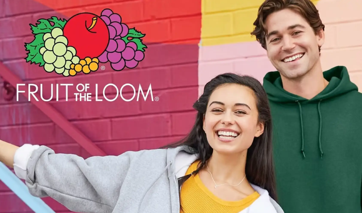
The Fruit of the Loom original logo featured an artistic arrangement of fruits, including red apples, grapes (both green and purple), and leaves. Its vivid colors and intricate design immediately made it stand out in an era dominated by simple, monochromatic logos. However, the design of the logo has evolved over time to align with branding trends.
The earliest version of the logo was detailed and elaborate, incorporating the fruits with a classic artistic touch. This was reflective of the design trends of the late 19th century, which favored ornate and highly decorative elements.
During the mid-1900s, as brands started to simplify their visual identities, the Fruit of the Loom old logo underwent refinements. The fruits became less detailed but more vivid, balancing simplicity with recognition.
In the 1970s and 1980s, Fruit of the Loom adopted a cleaner and more modernized look. The focus was on making the logo easier to reproduce across different media, a common trend among global brands at the time. This design remained true to the brand’s identity but emphasized versatility.
The most recent version of the Fruit of the Loom logo retains its iconic fruit cluster but with a refreshed, contemporary style. The colors are brighter, the lines cleaner, and the fruits more stylized. These updates make the logo easily adaptable for both traditional and digital marketing channels.
For those asking, “Did Fruit of the Loom change their logo?”, the answer lies in these subtle design shifts over time. While the essence of the fruits has remained, the presentation has evolved to stay relevant to modern aesthetics.
Also Read More on Fanta New logo – A Refreshing Change in Branding
One of the most fascinating debates surrounding the Fruit of the Loom logo is the Mandela Effect. Many people mistakenly remember the logo featuring a cornucopia—a horn-shaped basket overflowing with fruits. This collective false memory has led to widespread confusion and speculation about the old Fruit of the Loom logo.
However, historical records and branding archives confirm that no version of the logo ever included a cornucopia. The logo has always depicted the fruits alone—apples, grapes, and leaves—without any horn of plenty.
So, why do so many people believe otherwise? The association likely stems from the fruits themselves, which are commonly tied to the imagery of abundance and harvest, concepts often linked to a cornucopia. Despite the evidence, the belief persists, adding an air of mystery to the Fruit of the Loom original logo.
The Fruit of the Loom logo is an excellent example of timeless branding. Here’s why it continues to resonate with consumers:
The evolution of the Fruit of the Loom logo highlights the importance of strong logo design. While simple at first glance, the logo conveys layers of meaning that resonate with consumers. Whether you’re building a clothing line or launching a new brand, investing in a memorable logo is critical for success.
For brands today, trends favor simplicity, adaptability, and emotional connection—values the Fruit of the Loom original logo has exemplified for over a century. A great logo isn’t just a visual; it’s a story, a connection, and a promise.
The Fruit of the Loom logo remains one of the most enduring and recognizable logos in history. From its early detailed designs to its modern streamlined versions, the logo reflects the brand’s commitment to quality, reliability, and timeless appeal. While debates like the cornucopia mystery add intrigue, the reality is clear: the Fruit of the Loom logo has remained a symbol of trust for generations.
For those inspired by the success of brands like Fruit of the Loom, crafting a powerful logo is essential. If you want a design that tells your brand’s story and leaves a lasting impression, Moonbox—the leading branding agency in Dubai—can help you achieve a logo that resonates with your audience and stands the test of time.
