Synonymous with delicious ramen, Roc-N-Ramen’s warmth in a bowl extends to its customer-centric focus. With impeccable service, a personal touch, and homeygoodness at its heart, Roc-N-Ramen aspires to pack a punch of flavourful fusion and bring a smile with every soulful bowl.
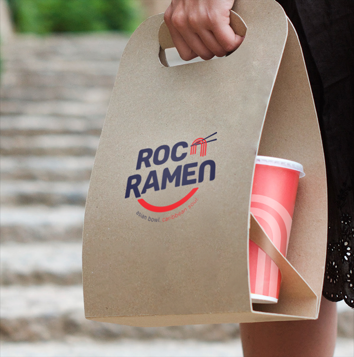
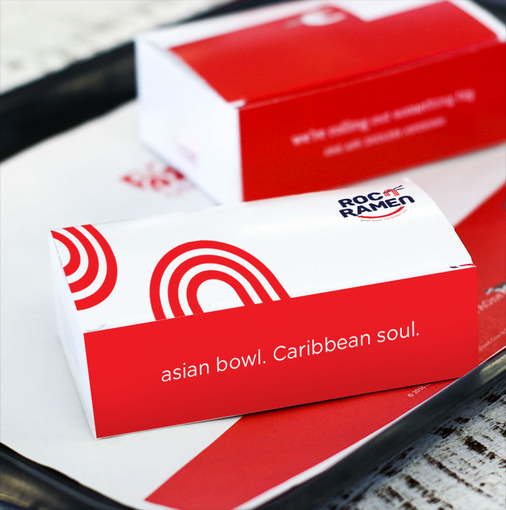
Roc-N-Ramen, whose signature tonkotsu ramen was described by the New York Times as “full of tasty solids and toppings afloat in a hot, smooth and buttery broth,” was already synonymous to great food and great times for the New Rochelle neighbourhood. Being an American brand, they were now forging uncharted territory and needed to appeal to the local market. This entailed a brand refresh and solid messaging that will resonate with its newmarket—Dubai. Roc-N-Ramen represents fun and family, so there was a need to highlight these elements, making it more globally relatable.
We realised that Roc-N-Ramen is all about balance between two opposing forces:excitement and relaxation, home and adventure, and fusion that clearly represents its flavour origins from opposite sides of the world. Just like its vibrant, indulgent bowls, Roc-N-Ramen spreads excitement with bold flavours and fuelling happiness for customers in the casual dining market. Roc-N-Ramen knew its values, had.a strong story, and worked stealthily towards its goal. All it missed was a direction, and that’s what we catered to.
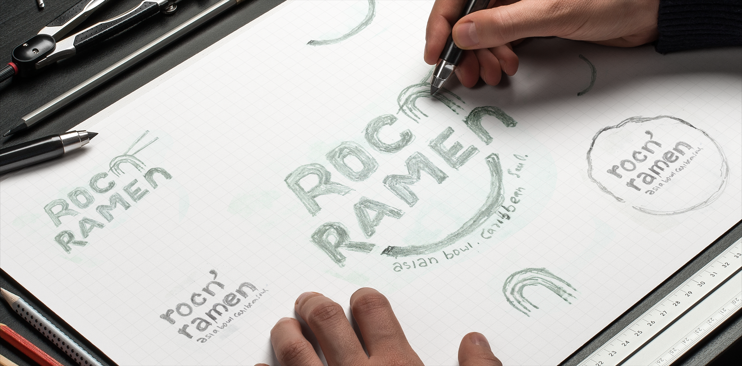
We believe that logos tell visual stories, which is why for Roc-N-Ramen we created a single graphic element as part of the logo, which represented the brand perfectly. The ‘n’ from Roc-‘N’-Ramen was shaped like strings of ramen being lifted up by chopsticks. Below the brand name is another string of ramen, twisted to look like a smile – because that’s precisely what a warm bowl of ramen does – brings a big smile to your face! One look at the logo and you know exactly what the brand portrays. The fonts used were soft-edged and straightforward, to appear friendly, while the primary colour palette consists of pastel yet understated shades, portraying aninnovative, confident, and approachable brand.
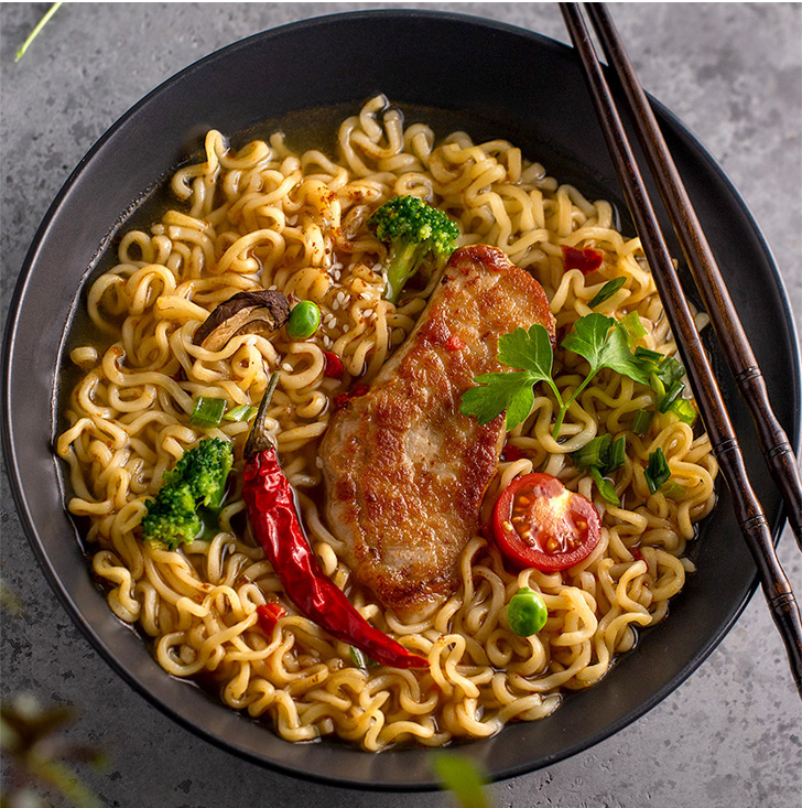
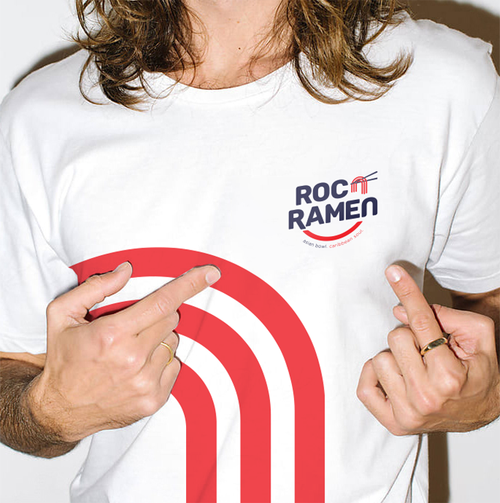
After getting the know the brand and its show-runners, we developed a clear, united brand purpose—’creating beautiful moments and opportunities through food’. This statement captures the brand’s raison d’etre: making beautiful and memorable experiences while opening the doors of opportunity for entrepreneurs. While they were already living their team values, it was important to articulate them. As the brand expands, their principles remain the same.
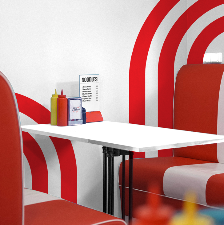
On the design side, we created a powerful visual identity to appeal to the international audience. We reimagined their logo, choosing to go minimal, minus the Asian fonts and usual design elements to avoid becoming ‘not just another Japanese food joint’.
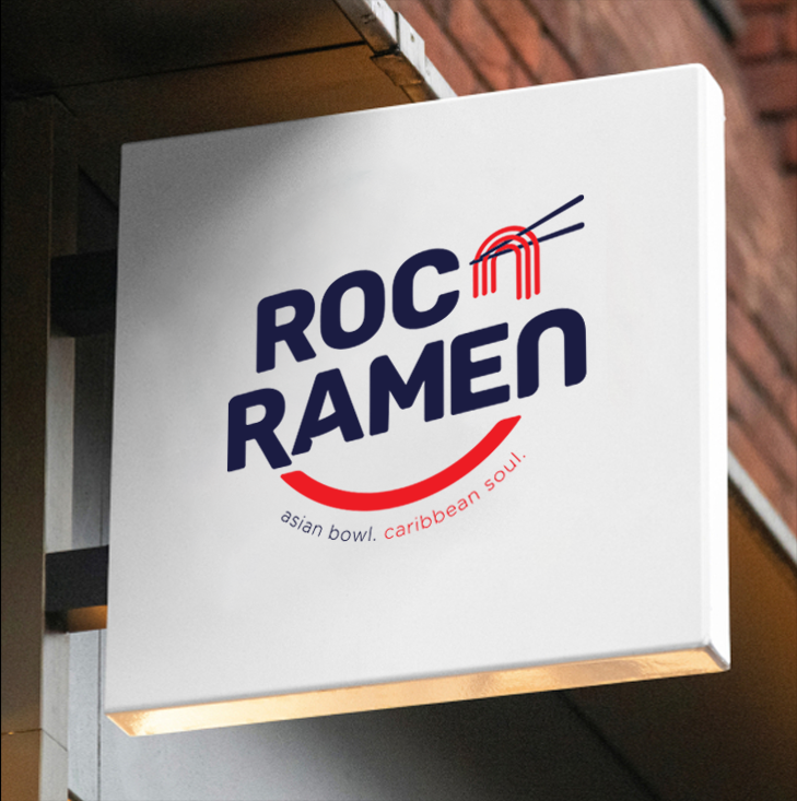
This was accompanied by the brand taglines “Asian Bowl, Caribbean Soul” for the American audience and “Smile in a Bowl” for territories outs ide of the USA. After its brand refresh, Roc-N-Ramen secured capital funding to open over 200 stores across the US, and is also steadily capturing the hearts of Asian fusion lovers across UAE, turning them and rest of the GCC, into bonafide “Slurpers”
